A booth design is like the icing on a cake. It won’t make the cake taste nice but it definitely makes the cake stand out. The ultimate goal of your booth is to:
- Grab the attendee’s attention.
- At the same time be on-brand.
- Answer the question “Who you are and what you do”
A lot of businesses can do #1 but not #2.
Grabbing attention is easy. Design a huge pink booth and get all your male staff to wear pink singlets and skirts and your company will be guaranteed to be the talk of the show. The hard part is actually grabbing attention while at the same time being on-brand.
The 7 ideas covered in this post are:
- Grab attention and be on-brand
- Articulate who you are and what you do
- Colours, colours, colours
- Use lighting to focus attention
- Incorporate motion into your booth
- Use focal points to direct attention
- Be different with unique shapes and materials
1. Grab attention and be on-brand
The goal of your booth is to grab attention which is the easy part. Design a huge pink booth and get all your male staff to wear pink singlets and skirts and your company will be guaranteed to be the talk of the show. The hard part is actually grabbing attention while at the same time being on-brand.
One of the mistakes, beginner exhibitors make during their trade show planning process is they pick the cheapest booth without considering the attention-grabbing prospects of it. Picking the cheapest booth option vs a more expensive booth design might be the difference between a trade show success and a trade show failure. Worst of all, most exhibitors tend to play it safe and blend in with the crowd.
“If the attendee doesn’t see you, she won’t be able to make the decision of whether to stop or not.” – Steve Miller
2. Articulate who you are and what you do
Last year, I was at a trade show for the printing industry and there was this booth with a huge submarine-shaped hanging sign.
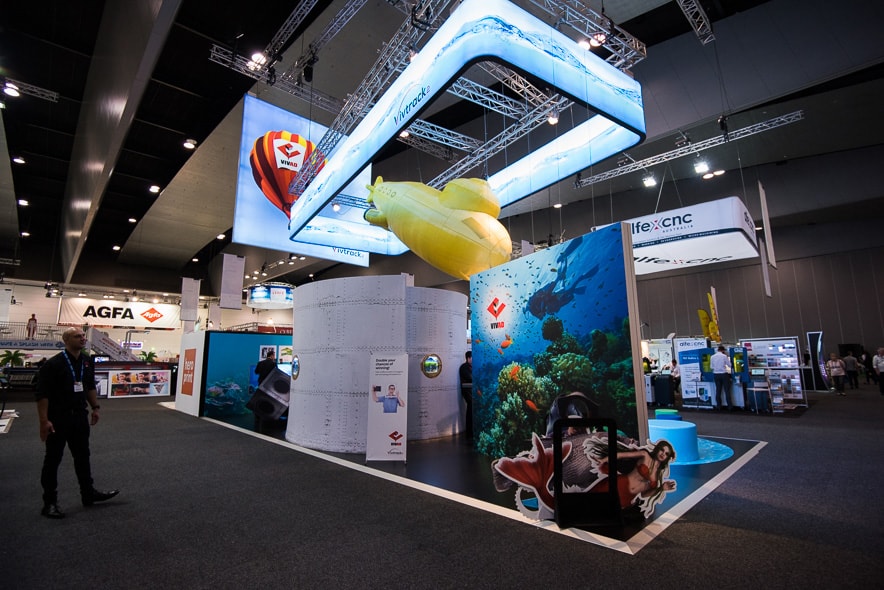
This was the one. It definitely stood out among other exhibitors. However, to this day I still don’t know who the company is and what they do. I know for sure it definitely isn’t Australian Submarine Corporation or another submarine building company.
You can get all the attention you want but if no one knows who you are and what you do, all those attention won’t convert into brand equity and most importantly sales.
Here is one that I like because:
- It is simple
- It stands out
- Most importantly you know what the company does – Artificial Intelligence

3. Colours, colours, colours
“Many years ago, somebody decided that IBM’s “Big Blue” was the corporate look. If you were going to be taken seriously by customers and competitors at a trade show, then you had to have that same rich blue colour in your exhibit materials and fabrics. Besides, you can’t go wrong by picking the same colours as everybody else, right? It’s safe. So over the years, we’ve seen a lot of “Big Blue” wannabes at shows around the globe. In reality, all this does is make everybody look alike. That’s exactly the opposite of what you want. Every day you and your company work hard to separate your company and products from the competition. You beat your brains out to show that you’re superior and different in some form, right? So then why go to a trade show, where thousands of current and potential customers are wandering through the hall, and blend in with everybody else? It doesn’t make sense.” – Steve Miller, author of How to Get The Most Out of Trade Shows
In short, avoid choosing colours that blend in to be safe. You invested a lot of money to exhibit at the trade show to attract new leads and clients so why blend in with everyone else.
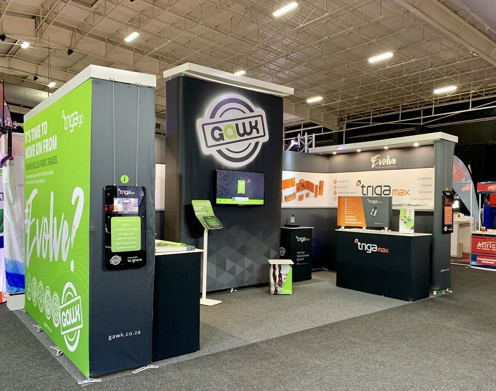
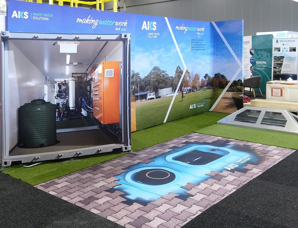
4. Use lighting to focus attention
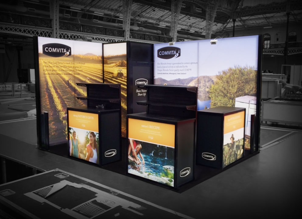
Lighting attracts attention and it can also be used to spotlight products that you want to promote which will give it the attention it deserves. Another good use of lighting is to create motions in the booth. On the other hand, too much lighting will cause attendees to steer clear away from that area.
Here are some examples of exhibition stands with excellent use of lighting.
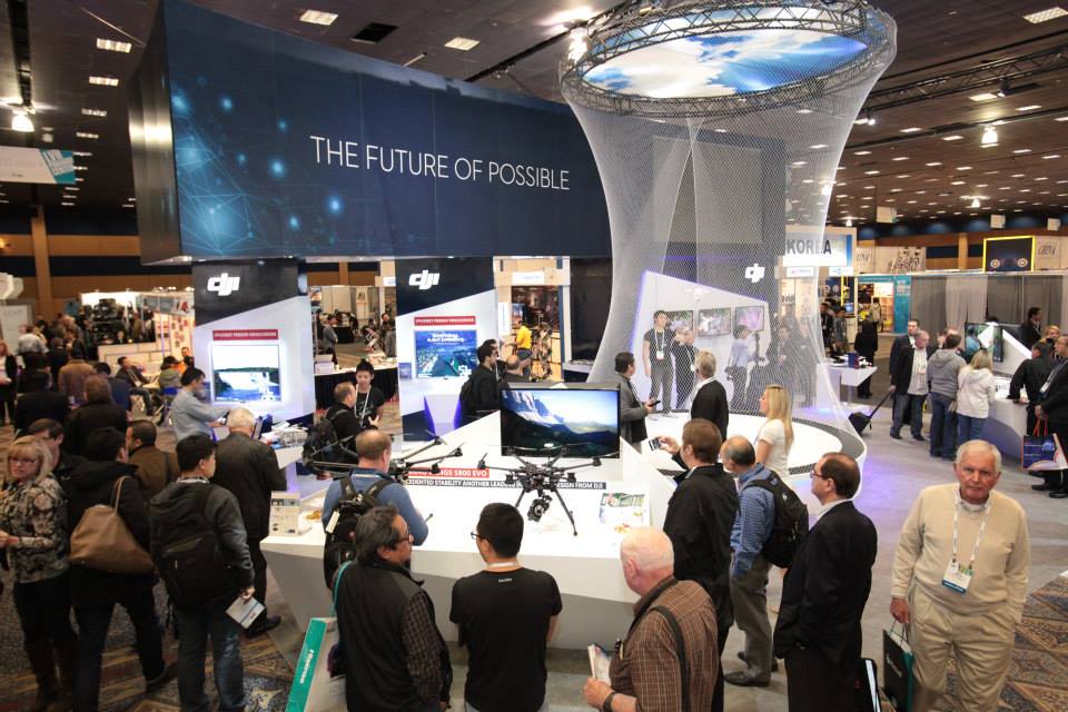
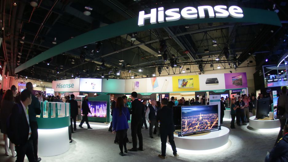
…or you can use backlit signs to stand out too.
5. Incorporate motion into your booth
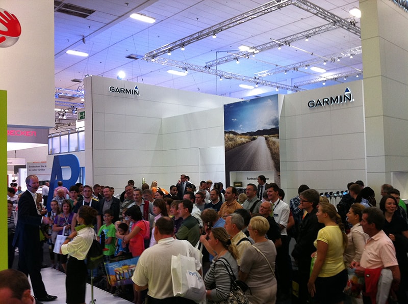
Most exhibits are static – walls, hanging signs, counters, etc. An effective yet underutilised method to grabbing attention is to incorporate some type of motion in your exhibit. It could be a video wall, a live mascot, or a product demo. The more unexpected, the more attention you will receive.
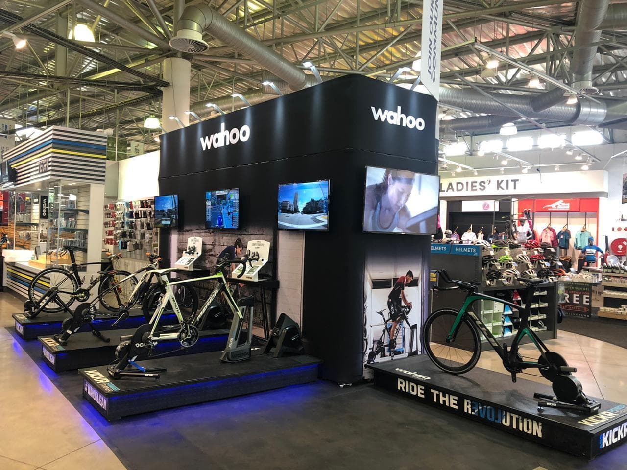
Here is a TomTom booth doing a live product demo in front of a huge audience.
…or create a 4K OLED tunnel-like what LG did in IFA, Europe’s largest electronics trade show.
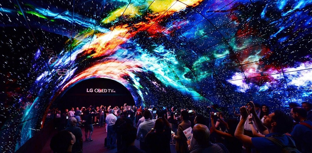
Here’s a quick one-minute video of the tunnel.
6. Use focal points to direct attention
Focal points are used to direct the attention of viewers to a specific location. They are generally incorporated in photography, architecture, and paintings.
For example, take a look at this aquarium.
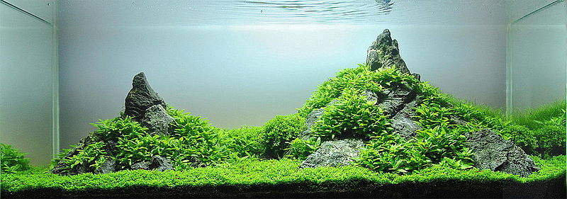
Which part of the aquarium grabs your attention?
The two mountain peaks? That is what focal points do. They focus the attention of your attendees on a specific area.
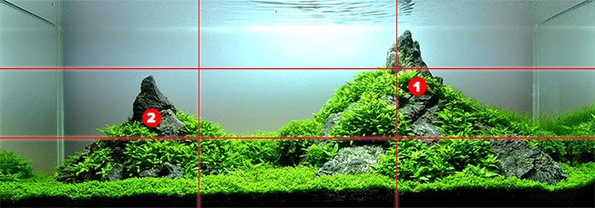
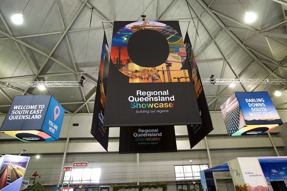
The benefit of having a focal point is it gives you the ability to “control” where you want attendees to look. In a trade show, using a large structure as a focal point will enable your brand to draw attention and stand out from the rest. Hanging signs with the company’s brand name is one of the best displays to use as focal points.
Towers are also another excellent exhibition display for focal points.
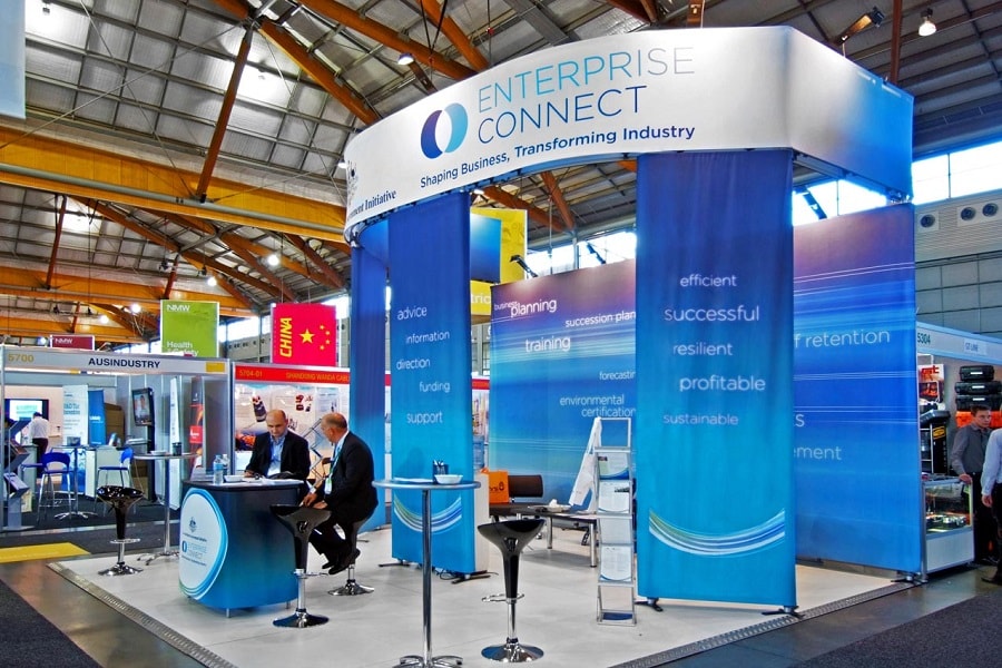
7. Be different with unique shapes and materials
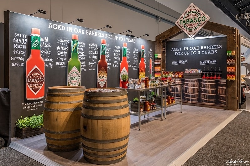
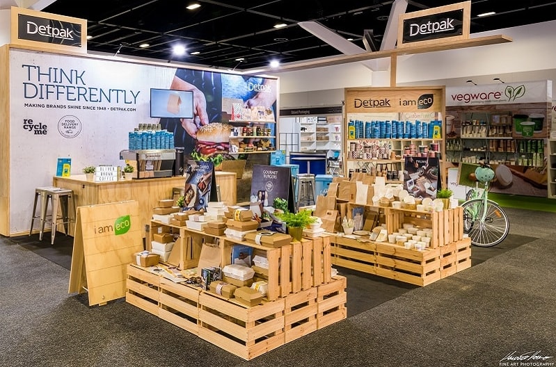
Incorporating unique shapes and materials that are not commonly used by other exhibitors is also another way to stand out from the crowd. For example, if most exhibitors use a circle hanging sign, go for a hanging sign with the shape of a rocket.
Here are three examples of trade show booths that use unique materials to stand out.

Recap
The 7 ideas covered in this post to design a trade show booth that stands out are:
- Grab attention and be on-brand
- Articulate who you are and what you do
- Colours, colours, colours
- Use lighting to focus attention
- Incorporate motion into your booth
- Use focal points to direct attention
- Be different with unique shapes and materials
