The majority of printed displays such as brochures, leaflets, and pull up banners are very sales-oriented. It’s either “50% off all our products. Sales end Sunday” type of brochure or a brochure listing all products with their prices.
Based on my experience, 99% of the time when I get these types of brochures it’s going straight into the bin within the next 5 minutes and the next day, I would’ve forgotten the business.
Most brochure printing companies charge between $0.50 to $1.00 depending on the quantity of your order. Technically, you’re paying $1 for less than 1 minute of your prospects’ attention. That doesn’t sound like a good investment. The reason for that is because of the alternative which is banner ads.
According to TubeFilter, you can buy 1000 of your prospects’ attention for $7.60 (2014 numbers) on YouTube. Assuming you bought 300 brochures for $300 and if you would spend $300 on YouTube ads, you could’ve bought 39,473 attention spans.
So…are brochures dead?
The answer is no. People still like to hold something physical in their hands compared to seeing something on a screen. The challenge here is giving them the brochure and making sure they keep it in their back pocket for a long time.
And we don’t keep “30% off sales brochures” in our back pockets, do we? We keep things that we think we need in the future and those are usually educational materials.
The answer here is to make your brochures educational. Your brochures should be telling your prospects “I’m going to make your life better.” not “I’m going to take money out of your pocket.”
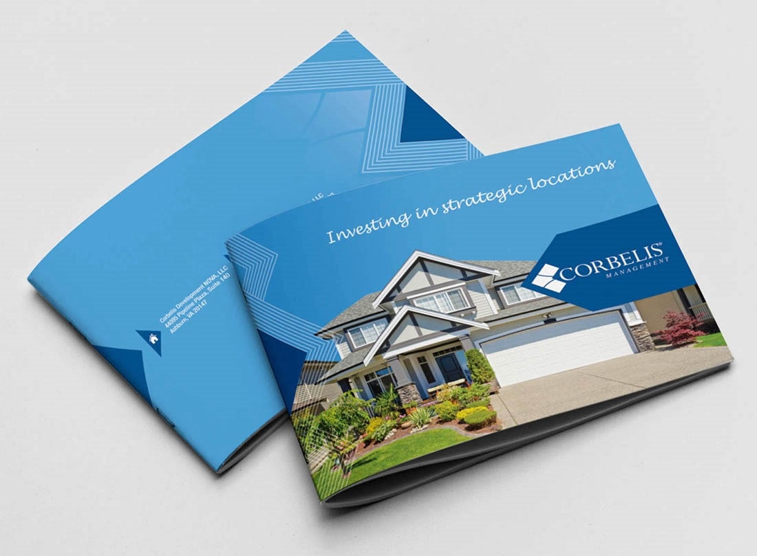
Laing+Simmons is one company that is using its brochures very effectively.
Here’s an example:
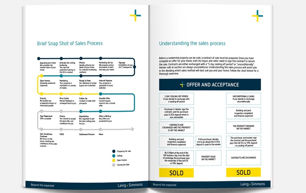
Selling real estate is quite a complicated process especially if it’s your first time doing it but their brochure actually explains to their prospects the steps involved in selling one.
Laing+Simmons isn’t talking about themselves in the brochure because the sales process can be applied to other real estate agents too. When a prospect gets this, they know Laing+Simmons actually know how to sell real estate compared to the real estate agent next door with brochures saying “We got over 20 years experience. You can trust us.”
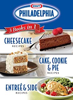
Kraft is also doing this with their Philadelphia Cheese but they took it a step further with their own Philadelphia Cheese cookbook. That is content marketing on another level.
How to make your brochures educational
Let’s assume you’re getting brochures for your digital marketing agency.
Step 1: Find your target market
Who are your buyers? For digital marketing agencies, it is:
- Brick & mortar business owners
- Affiliate marketers
- eCommerce stores
- Other marketing agencies who are looking for resellers
After you’ve defined who your buyers are, you want your message and design to align with them.
Step 2: What benefits would spark their interest
When someone is looking for a digital marketing agency, they are mainly looking for results in either their traffic, keyword rankings, sales, etc. So make sure your brochure talks about how your audience can achieve those benefits.
- Teach them how to set up a PPC ad.
- Teach them how to start SEO-optimizing a website.
- Show them what a full-stack digital marketing plan looks like.
- Show them the results of past clients with pictures and numbers.
Tip: If your benefits statements are too long, a link to a blog post would be a good idea.
Remember the Laing+Simmons brochure at the top? Their brochure teaches their prospects the process on how to sell a house. After reading that, their prospects could have gone out on their own to sell the house without Laing+Simmons.
Step 3: Design for 8-year olds
“Any intelligent fool can make things bigger and more complex. It takes a touch of genius – and a lot of courage to move in the opposite direction.” – Albert Einstein
“It takes a lot of hard work to make something simple.” – Steve Jobs
Here are some points to make your brochure as simple as possible:
- Make sure the important points are either at the top or highlighted
- Keep your sentences short
- Use simple words that even an 8-year old can understand
- Pictures speak a thousand words
- Organise your brochure with headings and bullets
Here’s an example of a brochure design to avoid:
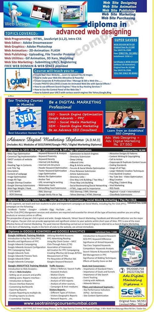
Why this is bad: Not organized. Too much text. No relevant images.
What a good brochure design looks like:
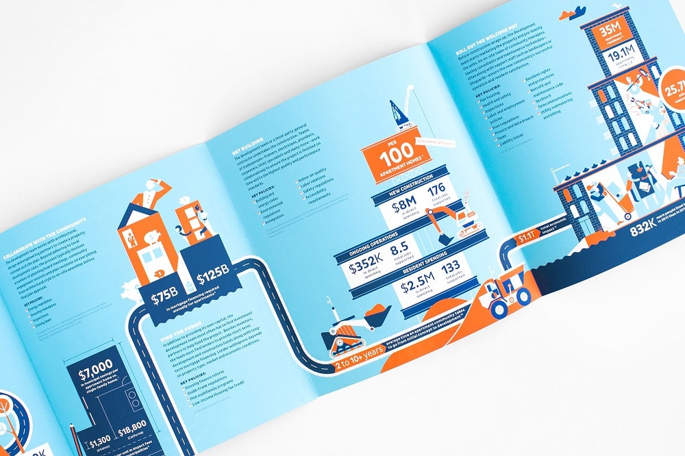
Why this is good: Sections and text are organised. Numbers, numbers, and numbers. Relevant and professionally designed graphics. Good flow from left to right.
Some further reading on brochure design: